Monday, December 29, 2014

Minion Time

Hello world,

It has been a really long time sinds I blogged, shame on me. Life got so busy. I did craft quite a bit this year, but sadly I gave away quite a few items before taking pictures and other pieces I took pictures but it didn't make my blog (yet). So I have got a ton of energy and a lot of nice projects and I really want to blog much more. It will be hard to do but I'm trying to get organised to get all done.

For today I wanted to share a little something I made for a phone, I saw some online but never the right sizes or the right kind of wool. So I just made up my own pattern with all the elements I like in other minion crochet work I saw.  And now my phone is safely kept :)


Thank you for reading my blog.

Caroline

Thursday, May 15, 2014

Mixed Media Canvas

Hello World,

This Mixed Media Canvas was very fun to make. I had the joy to work with really nice products.

First I did some gesso layers that I then painted with liquitex basics acrylic paint.
Some stencilling with modelling paste that was mixed with the new Prima color bloom spray (lime wedge), that gave such a rich texture. 
The girl in the open space is a stamp that I coloured in from the Santoro's gorjuss series.

And to finish it off I made some accents with Prima "Say it in Pearls" pears, Prima flowers and some metallic embellishments.


Thank you for reading my blog.
Caroline

Masculine Canvas

Hello world,

I wanted to create a more masculine canvas with the gorgeous Blueprint stamps from Tim Holtz.

 As a starter I prepared my canvas with gesso and then I painted it with acrylic paint. 
The images are on contrasting background to give it a bit more liveliness. And I uses some Distress Ink on the pieces of canvas that I cut open.


Thank you for reading my blog.

Caroline

Wednesday, May 14, 2014

Nametag

Hello world, 

A while back I made this fun tag, a name tag. 

I was playing around with some ink and stamps and suddenly this was the result, I  absolutely adore it and wanted to share it with all of you.


Thank you for reading my blog.

Caroline

Happy 30th Birthday

Hello world,

What to do when one of your best friends has her 30th Birthday. 
You make a nice card to go with her presents.

And so I did.


The background was made with Tim Holtz Distress Stains and a brayer. And some stencils and the Distress ink pads.

The balloons I stamped on water colour paper and coloured them in and cutting them out. And I added a tiny happy birthday stamp to them. 
I attached some white cotton string to the balloons that I attached to the 30 to give the illusion that the 30 is floating in carried by the balloons. The 30 is grunge board coloured with distress ink before adding some text stamp to give it some interest and to give the 30 a shiny look I added some glossy accent.

What do you think? Would you like to get a card like this?

Thank you for reading my blog.

Caroline

Baby card

Hello world,

I didn't get a lot of blogging time these couple of months and have somewhat to share with you guys so there will be a couple of posts today cause I have lots to share.

Firstly I'm going to share a baby cared.
A couple of months ago one of my colleagues became the father of a beautiful baby boy.

A lot of people needed to sign so I was aloud to really enjoy myself and make a big card (about A5).
The concept was also that when you put it on display you had the possibility to hide the name signings and just see design.

On the front I went for multiple layers with as focal image a baby boy with a toy bunny,  that stamp is too cute. Here I chose some pattern paper from the 6 x 6 basic grey "Oliver" paper pad and at the bottom a little piece of Graphic 45. The baby was coloured with the Tim Holtz Distress Markers on water colour paper (no special brand, I use the one from my local art store). And I could not resist to ad a few ladybugs. Cause ladybugs are for good luck and what a better way to welcome a little baby by giving some good luck. 


The other side of the front panel was a pocket with a tag inside.I didn't find any patterned paper that I wanted to use, so I made my own with Tim Holtz Distress Ink and the Tim Holtz Layering Stencil (Stripes - THS004). The Stencil was not big enough for the piece that needed to get done but with a bit of handiness you can reposition the stencil and continue your background.

The image used is one off the blueprint stamps from Tim Holtz that was stamped on water colour paper and coloured in with Distress markers. It was attached with some dimensional foam in order to create a nice pocket for the tag.
On the tag you can put some extra message or some useful information like what you bought from the birth list and when it will be available for pick-up or whatever you want it is bonus space.


Next to that I did a panel with a present and balloons that said felicitations in different languages, I added a felicitation to the yellow balloon as well later on.
I did the same background as in the previous panel. The balloons are also Tim Holtz blueprint stamps that I stamped on watercolour paper and coloured in with the Tim Holtz Distress Markers and I cut them out.
I attached some white string to them that I attached to a little pin from the Tim Hotz idea-ology line.


When you opened the card you see those two panels, it was very funny actually because a lot of people were confused were to write their name. There are two panels to write on behind the balloon panel which opens up. Sadly I don't have a picture with the open card.

 
Thank you for reading my blog.
 Caroline 

Friday, March 14, 2014

Graphic 45 Design Team 2014 Audition

Hello World,

Today will be a huge post with lots of photos. I hope you'll bare with me and remember feedback is much appreciated, so leave a little comment at the end of the post.
This post is my audition for the Graphic 45 design team. I love this brand, the ideology behind it and simply its gorgeous designs. I hope that I did them justice. 

My first project is my graphic peacock. From the moment I saw the paper with all the peacock feathers I knew I wanted to do a peacock layout. But then during a shopping trip to a garden center with my best friend, thanks again Ruth, I found this super cute peacock in papier maché and it just clicked, I had to do a graphic 45 peacock.
So after a lot of fussy cutting, inking and some painting and a lot of patience this little fellow came to be, I'm calling him Leon.


The second project is a little sweet sentiment Easter box. The Easter box is to be used as a creative way to present Easter eggs as a gift or to use for the Easter season. 
It is made out of wood, the sides are solid wood and the middle part consists of one wood veneer piece that goes around the whole box.
It is so nice but also a bit tricky to work with wood veneer.  The veneer can't take heat or liquid very well. With a lot of care and attention to the material it is possible to use distress stain.
The paper collection that I used is the sweet sentiment paper collection by graphic 45. It is a collection that is having a lot of nice detailed images where you can do a lot of fussy cutting. I really enjoyed it.


For my third project I was still very Easter inspired and mad e big Easter card. It is about 15 by 22 cm (6 by 8.5 inch). I was finishing up my Easter box when the idea sprung on me and I let the creative flow guide me to this cute not so little card.


My fourth project is a couture canvas.  And because I wanted an original twist I cut open the canvas to accentuate the image that is being uncovered.  The image in this space is completely built up in 3D giving it all the depth it deserves. A while back I saw Arlene from the current graphic 45 design team make little banners from the branding that is on top of the des paper,  I found this so cleaver and wicked cool that I wanted to do this sometime as well. In this design I found the opportunity to fit in the little graphic 45 banner. Thanks for the tip Arlene.
As it is quite a big canvas (45x45cm – ± 17,75x17,75 inch) I kept the outsides of the cut open area simply to pull the focus to the center image.


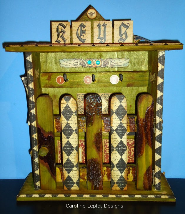
A key-cabinet made my 5th project.
I used one of my older collections, old curiosity shop, that is a bit steampunky as I have a serious weak spot for Steampunk. The cabinet itself is wood. I gave it some color with distress stain because then you can still see the wood pattern. And to make it a bit more distressed I used crackle paint and some vintage photo stain, the stain I used on lightly on the whole cabinet to give it a bit more interest.
The inside was kept simple so that it is a usable key cabinet.


As sixth project I had to put up one of my favorite projects I ever made. It is a Steampunk Spells tea box. I made this project last October for my Halloween get together and loved it ever since. It is wooden box colored with distress stain. And embellished with Steampunk Spells paper cutouts, some chipboard, stickers, … some images were cool to use but didn’t really pop-out, to help this I used some distress ink to give a bit of color to give the needed dimension.


These were my projects, I hope you enjoyed viewing them. Let me know what you think.
I’ll get back to you soon so that I can tell you a bit more about me and this projects in the Next round of the Graphic 45 Design Team selection, if I make it that is, wish me luck.
Thank you to the whole Graphic 45 Team to make this journey a lot more interesting, and for opening this design team call. 

Thank you for reading my blog and enjoy a crafty weekend.

Caroline